TASC Force Tips
- Author: Frank Biolsi
Here’s a great example of how combining technology with experience and judgment makes for a solid diagnosis and repair.
Rex Wheeler of Bud’s Transmission in Marysville, Wash., and a member of Transmission Rebuilders Network International Inc., demonstrated his skill in this regard and has allowed us to share his findings with you. Rex’s problem was a 2000 Olds Bravada with 60,000 miles and a customer complaint of a “double downshift” while increasing speed from a steady cruise or applying more throttle while going up a hill.
Although Rex has seen excessive slip and 1870 codes in 4L60-E units, he observed that this unit felt as if it would actually start to unlock, then start to lock up, then release. Tip of the hat No. 1 to Rex at this point. He paid attention to the customer’s specifics and test-drove the vehicle with an open mind, ready to observe what happened and gather more information. Our tip of the hat No. 2: Rex not only has the capability to do data recordings but also took the time to do them and then analyze the information before proceeding.
Some folks have not had an opportunity to use data recordings as a diagnostic tool. When you first start looking at recordings, there appears to be so much data that it’s hard to find the answers. There are a few techniques I have found very useful in getting the information I need. The “before” graphs show the readings used to verify the complaint and diagnose the problem.
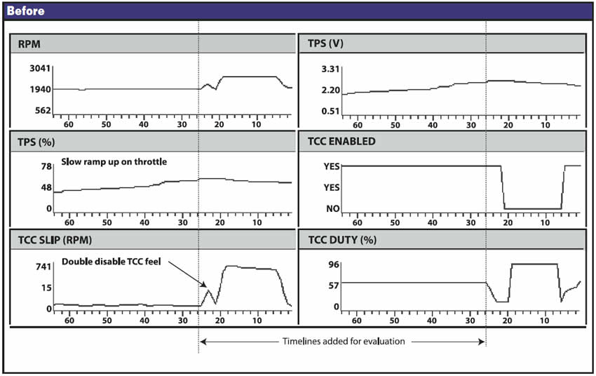
When dealing with recordings and a customer complaint, you should always start with a look at speed (rpm). If you can see something significant enough to match what the customer would actually feel, keep going. There may be many input and output signals jumping around all over the page but what you want to look at is when the customer “felt” the problem, and speed change often will help you find the time to narrow in on.
Draw a timeline or use an onscreen movable timeline. On this graph, just your eye could tell you that the customer felt the double bump (rpm) and that TCC slip appears to be the cause. We added a timeline to both the left- and right-hand columns of the graph to show a common point in time, indexed by the start of the slip-rate change. Using the line, we can see that what the customer felt was caused by TCC slip-rate double spike initially triggered by a TCC duty-cycle change. Using the line as a starting point, we can look at what caused what, and when. In this instance, we do not see anything commanding the double bump. Duty-cycle reduction is a slow, even ramp-down but the slip-rate response was bumpy. The timeline also points out that this problem was not part of actually unlocking the converter. That clearly occurred later (TCC Enable goes to off). This EC3 unit was trying to add some controlled slip when the problem occurred.
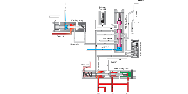
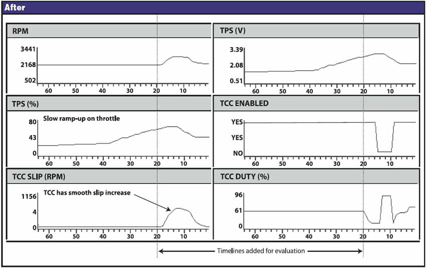
With all that information on his side, Rex knew the TCC isolator/regulator valve would be responding to the duty-cycle change and should have duplicated the gradual reduction of apply pressure and increasing slip rate the signal commanded. The “after” graphs show that his diagnosis and repair were on the money. After replacement the TCC-regulator-valve lineup, a smoothly ramping-down reduction of the TCC duty cycle creates a smooth increase in slip. Full unlock of the converter occurs shortly after, with TPS voltage at that point clearly showing why.
One more tip on graphs and timelines: Don’t worry about minor irregularities that may appear as either a slight delay in a response or even a response appearing to occur just ahead of a command.
Computers are fast, but they still read only one signal at a time, reading each one in turn, very quickly, limited in speed more by the data links they use between controllers. Then, when you take a recording, the information often is transmitted through slower communications and links and gets converted into a graph display by a computer program. Depending on the time-duration spread of your graph, irregularities will appear. Don’t worry about an exact lineup of time. In reality, no two readings on the graph represent signal readings at exactly the same instant, but they are lined up closely enough for you to trace a chain of events and come up with a solution.
One final suggestion for making graphs more useful is to consider which things to record, or at least which things to display. Once more, Rex made great choices. We left two of his displays out, for space reasons. His original graph showed what you see, plus Break Switch and Trans Temp signal. He wisely included things that could have triggered what was potentially a lockup-related issue.
One suggestion is to remove TPS percentage. TPS voltage always should be a part of the graph, but the percentage display is just the computer doing a calculation of the same voltage reading to display it as a percentage. Rather than duplicating this information, I would substitute VSS signal for the TPS percentage. That helps monitor the conditions around the reported error better and makes duplicating the problem on a road test easier.
The key idea here is to set up your test to get the information that defines the conditions for you and also provides data on changes in commands and monitoring of the responses to those commands. A common mistake on recordings is to include and display too many signals. The answer you are looking for is still there but may be harder to find. You can easily make it a needle in a haystack by adding too much data to the mix.

Frank Biolsi is technical-support manager at Sonnax and a member of the TASC Force (Technical Automotive Specialties Committee), a group of recognized industry technical specialists, transmission rebuilders and Sonnax Industries Inc. technicians. ©2006 Sonnax